Continuing from my initial image project, I have developed quite a few more images to go with my website. Most of what I said in the original project post still stands– think of this as an “update”, rather than a replacement post.
I wanted to keep the theme cohesive when constructing my main website, as I was mostly happy with it, and think it reflects my personality and how I approach the digital world. I kept the favicon and background images the same, as I thought they looked cool, and were in line with the quality I wanted from my site.

First, a new banner! The original banner looked pretty scuffed, and wasn’t in line with the quality I wanted from my site visually. This new one keeps the same color scheme, while being more high-quality and visually appealing. I wanted it to resemble the “web”, in a way, with the lines crossing over and intersecting. They also sort of give it a polygonal texture, which I think looks cool.

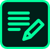


Next, these button navigation icons! I made the square shape and background in paint.net, and sourced the actual icons from iconmonstr.com, a free icon website, with minor edits. These also fit the green technological theme I have going on, and are immediately clear on their function.
I wanted the website to look unique and home-brewed, and I think I succeeded in making these icons visually and thematically cohesive. They also resemble the grid texture on the background, so there’s synergy if you consider “rounded blocks” an aesthetic theme.
The phone is just an extra icon I included on the contact sheet– I edited the color scheme to fit the rest of the website as well.
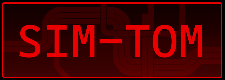
For my portfolio page, I wanted to make a visual button for my E-Lit project, since I wanted to feature that on my page. I basically made a basic font logo, but for the background texture, I used a Metro Map edit that I found on Reddit. The Metro is an important location in SIM-TOM, and also resembles wiring, so I think it was thematically relevant and also looks really cool. It doesn’t fit the site’s color palette, but red/black is the color scheme of the game, and I think the contrast in color looks cool juxtaposed with the rest of the site.
I’m really happy with how all of these turned out. The biggest missing aspect for me is that there’s no image of myself, which is somewhat out of my hands, as I will have to wait until I have a professional-ish image taken of me. I think that these images all contribute to a cohesive and easy-to-understand website layout.