When thinking about the future theming of my blog, I want to emphasize function and fun rather than focusing on purely sleek design.
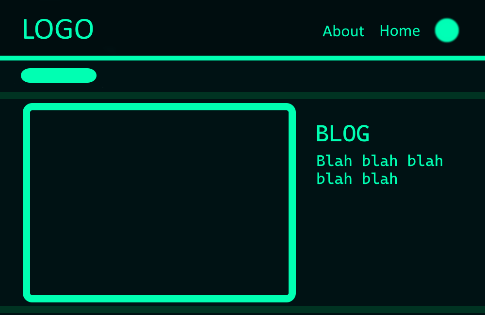
Here’s my initial concept. It’s pretty similar to what I have right now. I want to make the background darker, and I want to keep the green theming as much as I can (it’s my favorite color). I want to modify the theme so that the outlines of the header and the blog posts are green, as well, as opposed to just floating there. I think it’ll give it a bit more of a techy/neon aesthetic, and as I said, I’m approaching this from the lens of “this is a website, might as well make it cool”.
I know it’s a bit tacky, but I want to keep the scrolling news thing. I think it’s goofy but I like it when sites have “functions”, and I find a scrolling news thing to be a lot of fun from a tactile perspective. I’m making a website that doubles as a portfolio, not a glorified slideshow. I’d like to make the Something’s Brewing… text black, if I can figure that out.
As for images I’ll need to create–
- I’ll need a header. I was thinking a simple gradient header with some sort of grid pattern on it. Something reminiscent of old Wii graphics, which is an aesthetic I like to pay homage to a lot.
- I’ll want to make (or find) custom icons for my widgets. For example, a special magnifying glass for search. I can make these myself, or I can find these on Canva.
- A loudspeaker icon for the blog section would look cool.
- Possibly the biggest undertaking is making a unique logo and/or favicon to appear on the tabs list.
- I want to have the favicon have my initials in some sort of stylistic manner. The problem is that there’s a popular first person shooter whose icon is also a combination of O and W. So I’ll need to innovate in a way that sets me apart from Blizzard’s iconography.
- As for a full logo…. I might just sign my name. I have Clip Studio Paint and it has a cool calligraphy pen. I could also just type my name in the Continuum font, which is, for all intents and purposes, the Wii font.
- Speaking of fonts, I’m thinking about the fonts I want to include.
- I’d like to find an all-caps “LED text” font for the news scrolling to make it more closely resemble a physical scrolling LED light thingamajig. I’m not sure what those are called, but we have a business building here on campus with those sort of lights displaying the stock market, and I’d like it to resemble that, just for a twinge of flashy skeuomorphism.
- Otherwise, I do like the font we have now.
I’m realizing I probably should also have an image of myself on the page somewhere, but I’m not sure what I’d include. I’ll need to get a professional picture taken at some point.
There’s a lot to think about regarding visual design for a website, so I’ll be iterating on these concepts as I plan things out more fully. But this should outline a pretty basic direction I intend for my website.